IA Interactive was involved with making branding decisions for new and existing applications, recommendations concerning the overall user experience, as well as aid in the development of four main applications.
Each icon incorporates the NAMB ">" symbol and is related to the purpose of each app.



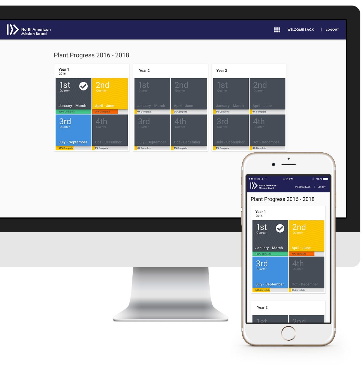
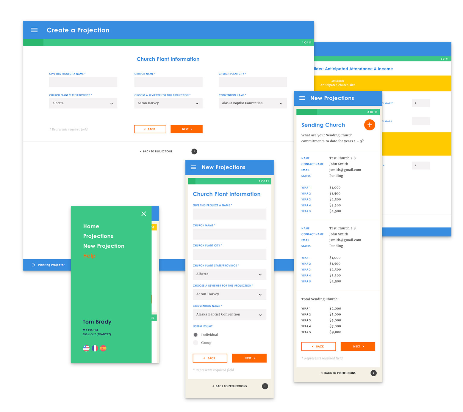
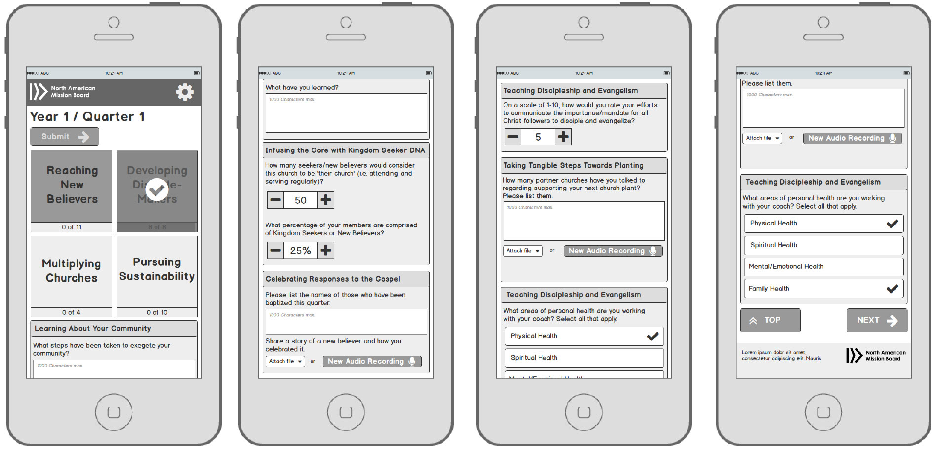
Built from scratch by a team of IA'ers - this application was designed in Angular and uses recommendations from Google Material Design. Centered around a mobile first perspective, the tool is meant to help users have quick and accurate way of inputting report data gathered over a period of time.
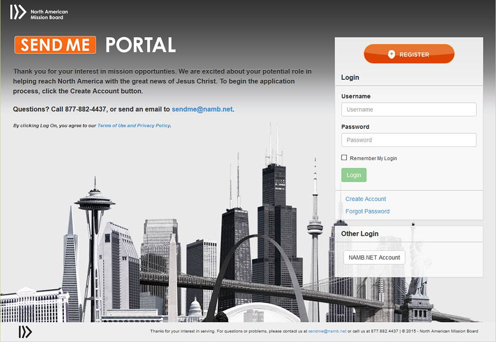
Send Me Portal had been through a few iterations during development and implementation and needed it’s branding brought back to a thoughtful center around NAMB’s most current branding guidelines. Here you can see a before and after as well as an update that included responsive design down to mobile.
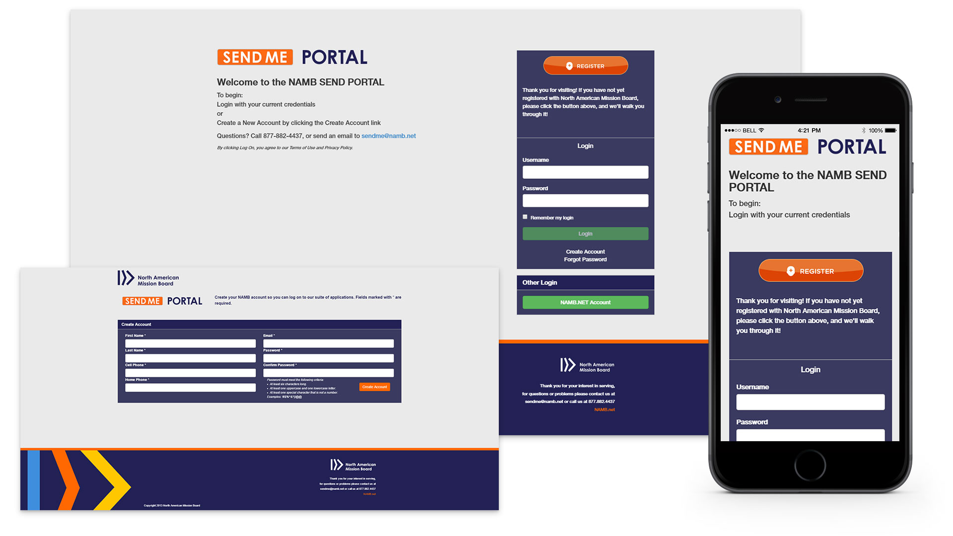

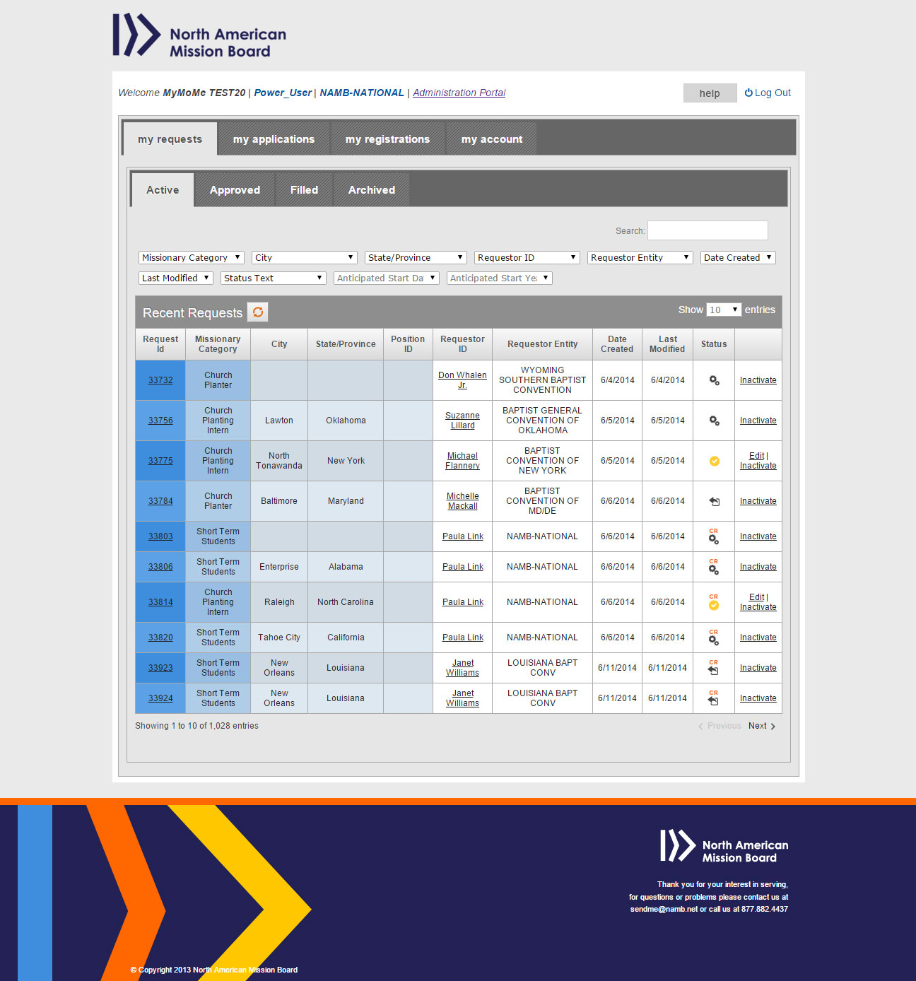
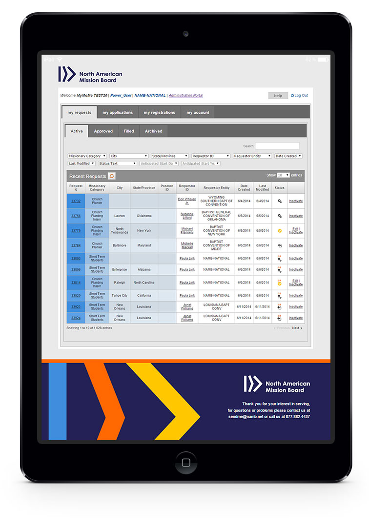

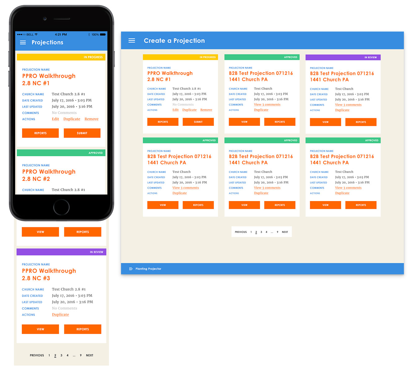
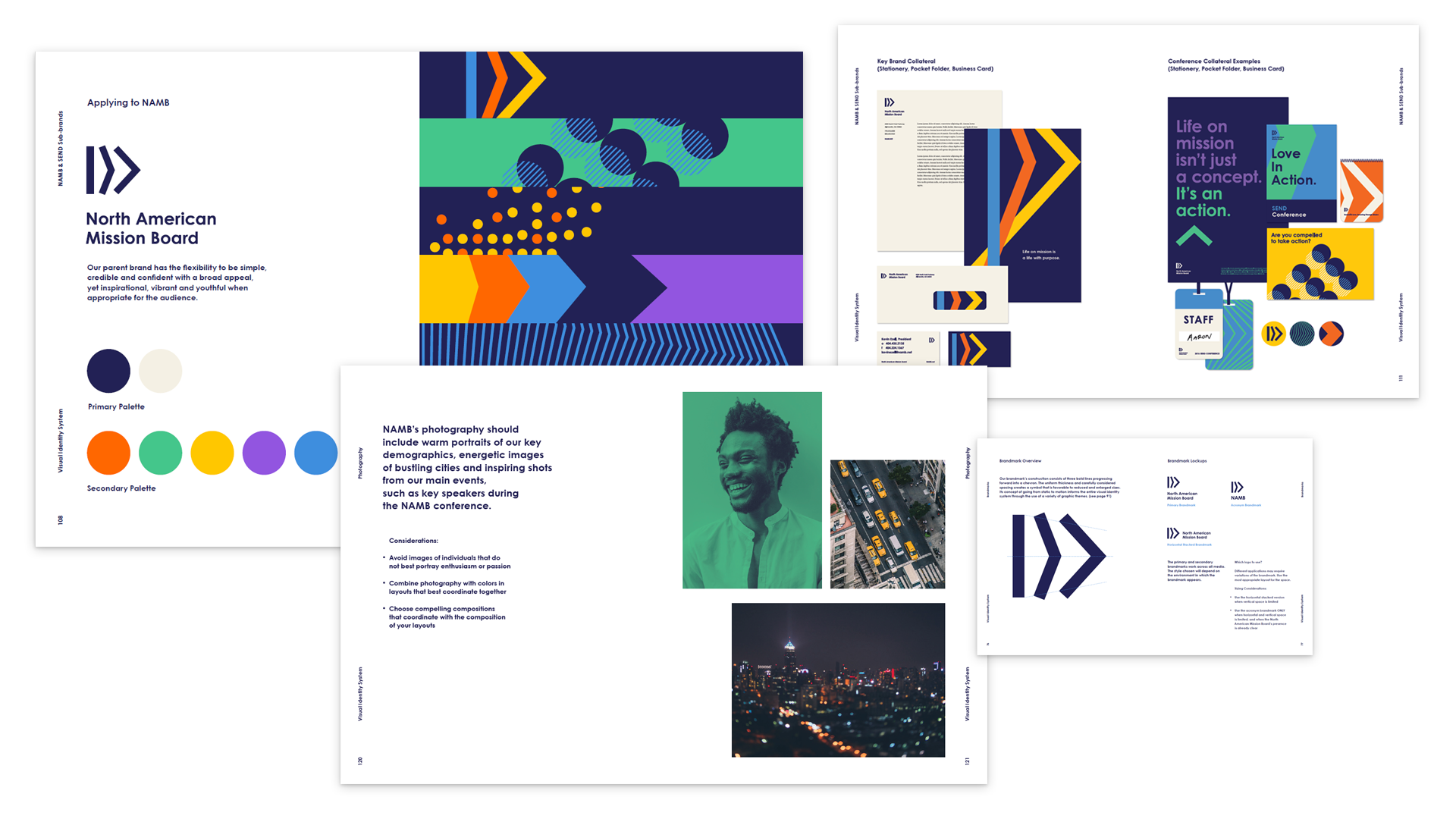
One of the challenges presented was a brand that had not yet found a consistent design across applications. Up until this point branding had been an afterthought. With the help of NAMB’s marketing and branding team, FiveStone, and IA, we started developing new applications to follow the same design patterns. Here are examples of how any remaining applications would be designed and how it would scale from desktop to mobile.
